Best Practices for Improving Core Web Vitals
Perfecting your page performance for these metrics is akin to baking cookies; follow best practices meticulously while tweaking ingredients here and there until desired deliciousness—or swiftness—is achieved.
Prioritize mobile optimization
You know the drill: you're on your phone, trying to check out a new site, and bam. It's like pushing a shopping cart with a wonky wheel. Mobile optimization is about ditching that wobbly experience for something smoother. Google's been clear—mobile-friendliness is king in SEO town. So, make sure your site doesn't just work on mobile; it should feel like it was born there.
Start by sizing content to the viewport; no more pinching and zooming is needed. Then tackle those buttons; they need space; too much accidental clicking around here can be as frustrating as texting an ex—it never ends well.
Above all else? Speed matters. A page that loads at tortoise speed will bounce users faster than a trampoline park. By prioritizing your site for mobile first, you'll naturally have a great load speed for desktop as well.
Leverage a Content Delivery Network (CDN)
Serving up your website's files from one place is so last decade. With CDNs, you can store copies of your site at data centers closer to visitors worldwide—it's like having speedy little outposts everywhere that cache your site so taht it loads faster. This isn't just fast; we're talking light-speed compared to going solo from one server location.
To put this in perspective, when a website loads from a server across the United States, say you're located in Seattle. But, your hosting server is in Connecticut, and it can impact your site load speed by up to 1.5 seconds compared to loading from a server closer to your actual location.
Use preloading techniques
Preloading in the context of websites is a technique aimed at loading certain web page assets before the user requests them. This anticipatory approach can improve user experience by making pages load faster and more seamlessly, especially when dealing with large files or resources crucial to the site's functionality or presentation.
Here's how preloading works for websites:
- Resource Hints: Web developers use resource hints such as <link rel= "preload"> tags in HTML to inform browsers about which resources should be loaded early on. These might include scripts, stylesheets, fonts, images, and other media files that will play a critical role later in the page lifecycle.
- Prioritization: Preloaded resources typically have higher priority over others not marked for preload; this ensures they're fetched and processed sooner rather than later during webpage rendering.
- Asynchronous Loading: While preloading occurs behind-the-scenes without blocking initial page renderings (such as content visible above the fold), it prepares secondary items like images further down an article or heavy JavaScript widgets so there's no lag once those elements come into play upon user interaction.
- DNS Prefetching & Connection Preopening: By resolving domain names (DNS prefetch) and even opening TCP connections to servers ahead of time (<link rel= "preconnect">), browsers cut down on delays associated with establishing communications between client-server when requests are eventually made thus accelerating overall process significantly beneficial sites depend external domains serve various components e.g., third-party analytics services CDNs etcetera
- Service Workers Caching Strategies: Advanced techniques involve service workers—scripts run separately from main browser thread—to manage custom caching logic including pre-caching essential app shell model PWA Progressive Web Apps ensure instant reliable performance repeated visits potentially offline scenarios well sophisticated strategies leverage cache bursting update mechanisms maintain freshness while still benefiting speed improvements brought about through thoughtful preemptive asset management
- Speculative Parsing Browser Optimizations: Browsers themselves also perform speculative parsing look-ahead parser scans upcoming elements documents determine potential dependencies might require downloading start fetching these speculatively again aim minimize latency related waiting around actual execution point reached timeline website's interactive functionalities
Implementing effective preload strategy requires balance because too much premature loading could waste bandwidth harm performance if users never navigate areas where those resources were intended Conversely judicious use targeted helps create fluid virtually instantaneous experiences navigating complex feature-rich online environments – key satisfying modern internet-goers' expectations quick responsive digital interactions
Implement server-side rendering (SSR)
Server-Side Rendering (SSR) is a technique used in web development where the webpage's content is generated on the server rather than in the user's browser. This means that when a user requests a page, the server processes the request, renders the complete HTML for the page populated with all required data and sends it back to the client's browser.
Here's how SSR works:
- Request Made: A user makes a request to visit a webpage.
- Processing on Server: The server receives this request and prepares to render the content.
- Data Fetching: The server fetches any necessary data from databases or APIs that will be displayed on that page.
- Template Filling: It then populates templates with this data – these are usually files containing HTML mixed with placeholders for dynamic content.
- HTML Generation: Once filled out, these templates are rendered into final static HTML by whatever rendering engine or framework being utilized (e.g., React.js using ReactDOMServer).
- Response Sent Back to Client: This completed HTML along with CSS for styling and links/references to JavaScript needed for interactivity is sent back as response which can immediately be displayed by browser upon arrival.
How you implement SSR depends largely on your technology stack:
In Node.js environments: You would typically use frameworks like Express.js together libraries such as React.js (ReactDOMServer), Vue.js (Vue Server Renderer), or Angular Universal which offer tools specifically designed handle SSR effectively within their ecosystems
Example code snippet using Express + React:
import express from 'express';
import ReactDOMServer from 'react-dom/server';
import MyReactComponent from './MyReactComponent';
const app = express();
app.get('/', (req, res) => {
const reactElementHTML = ReactDOMServer.renderToString(<MyReactComponent />);
res.send(`<!DOCTYPE html><html><head><title>My Page</title></head><body>${reactElementHTML}</body></html>`);
});
app.listen(3000);
With PHP: Traditional CMSs like WordPress have built-in SSR; custom implementations may involve templating engines such Twig Symfony projects generate pages before sending them clients
Ruby Rails: Similar concept called "views" whereby ERB Embedded Ruby used produce full-fledged markup including dynamically sourced database information prior dispatch
To successfully implement SSR consider the following factors:
- Ensure synchronous operations are minimized since they block thread completing tasks promptly and thus could slow down response times overall, especially under heavy load scenarios.
- Manage SEO aspects properly because although one benefit of using efficient indexing search engines is that there is still a need to provide correct metadata link structures, etc., to ensure crawlers understand and navigate the site.
- Take into account the potential increase in resource utilization on the server side, given computation moved away from clients and towards servers. For websites with significant traffic, scaling considerations should be taken seriously to maintain optimal performance with a large number of simultaneous users accessing your site.
Optimize font delivery
Choosing fancy fonts might seem like a good idea at first, but they can slow your site down—kind of like explaining modern slang to your grandparents.
Optimizing font delivery is a crucial aspect of web performance and user experience. It can lead to faster websites by reducing the time it takes for text content to become visible and interactive, as well as minimizing layout shifts often caused by fonts loading after other page content.
Here's how optimizing font delivery achieves these improvements:
- Reduced Blocking Time: Fonts are often large files that can block rendering if they're not handled properly. By optimizing their delivery, you reduce render-blocking resources, allowing the browser to process and display text using fallback fonts until custom fonts have fully loaded.
- Efficient Font Formats: Using modern, compressed font formats like WOFF2 (Web Open Font Format 2) provides significant file size savings over older formats such as TTF (TrueType Fonts) or OTF (OpenType Fonts). Smaller files transfer more quickly over the network.
- Critical FOFT/FOUT Strategy: Implementing "Flash of Faux Text" (FOFT) or "Flash of Unstyled Text" (FOUT) techniques allows immediate rendering with system fonts while custom ones load in the background; once they're available, a quick switch occurs which has less impact on perceived loading times compared to FOIT ("Flash of Invisible Text"), where no text is shown at all until custom fonts are ready. While this strategy can be very effective, carefully analyzing your primary font is necessary, as the font switch can create a significant layout shift.
- Avoiding Multiple Variants: Each variant weight italic etc adds extra requests overhead consolidate use minimal number variants possible still achieving desired design effect.
Conclusion
So, you've got the lowdown on core web vitals. They're not just buzzwords; they're your ticket to a stellar user experience and better search rankings. Remember this:
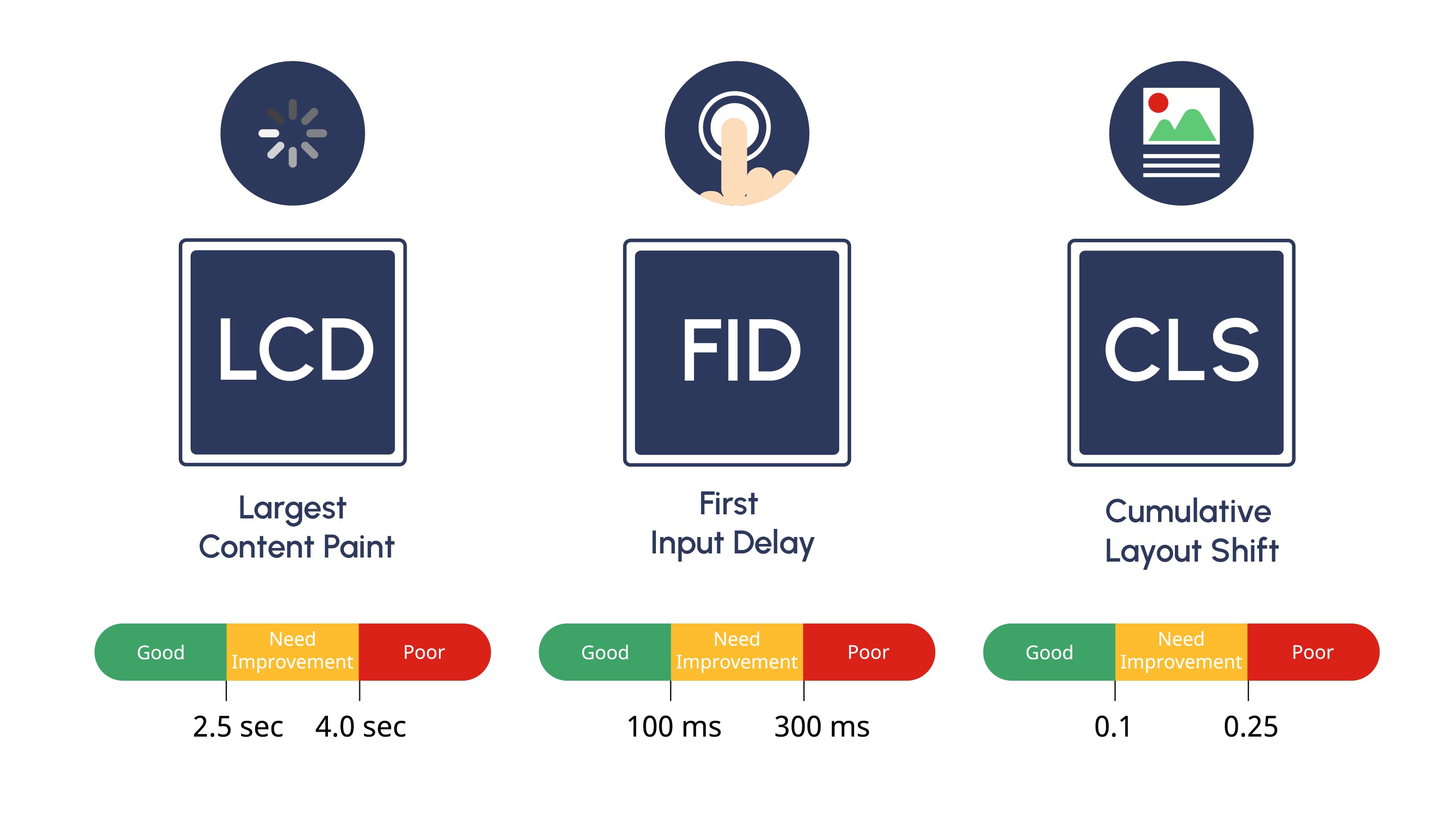
- Speed is king. That means Largest Content Paing (LCP) should be your new best friend. Keep those loading times short and sweet.
- Your site's responsiveness matters big time for keeping visitors happy and engaged.
- Cumulative Layout Shift (CLS) shouldn't give anyone a jolt. Aim for smooth sailing with no unexpected layout shifts.
If there's one thing to take away, optimizing these vital signs of website health isn't just smart—it's essential for success in today's digital world.